The Logo Game
One of the vexing tasks for any entrepreneur is to come up with a name for their fledgling company (see The Name Game), one that goes hand in hand with, if you’re not careful, an excellent opportunity to negate all the hard work exerted in choosing your company name: the logo. Recently, I had an hourlong conversation with a friend who’s going through this process with his company and it turns out that I’ve picked up some experience along the way that I thought I’d share here for others as well.
First off, get the name right. The name is the first thing that people hear or read in normal circumstances, so it has to sound good, read well and be easy to spell (unlike my friend mentioned above who misspelled the domain name for his company when he registered it). But it’s important to get the name taken care of first, because it can have an influence on the logo. Your logotype needs to somehow sit near the logo, so you’ll need to have a sense of how things fit together.
You’re the designer
You may have read that last sentence and wondered why I said that “you” will have a sense of how things fit together rather than a designer. It’s because you’re going to be the one who designs your company’s logo concepts. You’ll probably work with a designer, but ultimately, you’ll have to sit down with a piece of white paper and a pencil to sketch out some shapes. I strongly recommend bringing some design magazines and books along for inspiration and ideas. If that doesn’t work, open your iTunes library and flip through the album covers.
My own misadventures in logo design
When I was relaunching StyleFeeder last fall, I decided that I needed to upgrade our logo as part of our redesign. There’s never a good time to redesign your logo or rename your company, so that’s the first bit of advice: banging your head against this problem now until you have it figured out will be much more rewarding in the long run than settling for something that’s half right. I asked Ken, the designer that we were working with, to take a crack at some concepts. After a few days of stalling and delaying (atypical of his usual rapid turnaround style), I saw that he was really struggling with the task. So I let him continue struggling, but I went off and hired one of the many online logo sweatshops (search around in Google) for $500 to come up with a Plan B since time was getting short.
Ken did come back with some design concepts, but nothing impressive. I won’t show those here. Meanwhile, the logo sweatshop company’s designs were horrible. Completely unusable:
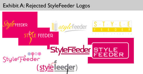
True to their promise, they did give me their money back since I wasn’t satisfied with their concepts. I started to realize that both designers were struggling with the name “StyleFeeder” as a guiding force of the logo, but I didn’t yet know why. As we were getting close to the launch date, I called up my friend Mia Moran at Emtype and asked her to come up with concepts. Mia called me back the next day and said that she’d spent 6 hours on this, hadn’t come up with anything good and wasn’t going to charge me. Honorable, for sure, but I was still lacking a logo. By the way, I should acknowledge both Mia and Ken here because they are incredibly patient individuals. It’s not abnormal for me to call someone up and ask them to design something for me in short order. By short order, I mean that if it’s 5:11pm, then I’ll need it by 5:17pm. Things like that happen at startups. That’s my story, anyway.
I actually designed the StyleFeeder logo by myself at 11pm the night before we went live with the newly designed website. I was able to come up with a few concepts because I’d learned about the process from Ken and Mia, but mainly because I just forced myself to really think through what I wanted out of the logo.
Emotional or Literal?
When you design your logo concepts, I learned that it’s instructive to think in terms of literal versus emotional sides of the design. A literal logo uses real-world recognizable objects in the design. An emotional logo uses shapes and color to communicate a message. There are certainly legitimate occasions for both kinds of logos, but at some point you have to realize that a logo is just logo. It’s not a business plan or a even a page of text in which you could communicate a message with much greater precision. So be realistic and don’t try to overload your logo with all the complexities inherent in whatever it is that your company does. It’ll need to look nice on your business card, your website and, if you’re really lucky, the side of your corporate jet. You’ll need to keep it simple with just a few colors and a few simple concepts.
A literal example
Here’s an example of a literal design from an Australian company called Knife, Fork and Spoon:
![]()
As far as I’m concerned, if your company name is so literal, then it’s going to be kind of weird and unimpressive if your logo isn’t at least as literal. What if their logo was just a blue circle? It wouldn’t make sense. In this case, it’s an easy win and their designer did a nice job putting the concept into reality. The logo above also communicates more than just a visual reinterpretation of the company name. It’s orange, so it tells us that it’s fairly modern. It’s built like a coat of arms, so they must be having some fun by putting such commonplace objects into the design, rather than lions or shields. The lines are very simple and clean, so this really helps to explain certain aspects of what the company is about.
An emotive-literal example
Now let’s look at an emotional logo that has some literal elements to it:
![]()
This logo is much more emotional, but it’s somewhat literal. It’s got lots of nice colors and fun shapes, very summery and sunny. That’s the emotional part. But it’s also quite clever, because the colored shapes correspond to various islands in the Bahamas, which is a clever fusion of literal and emotional elements.
The obligatory StyleFeeder plug: the emotional example
Of course, this post wouldn’t be complete without showing the StyleFeeder logo, which has no literal elements at all, but instead relies entirely on an emotional design to communicate an idea. What the other designers were struggling with was their tendency towards the literal, rather than trying to convey some simple emotions like fun, happy, young, energetic and simple. Notice that the logo doesn’t try to convey shopping, community, sharing or interaction. If you want to convey a process or activity in your logo, that could work, but you’ll need to base it on emotional foundations.
![]()
As we move along the spectrum from literal to emotional design, you then have to consider the increased reliance on visual language. You’re obviously familiar with language, because we use it communicate with one another all day long. What you may not have exposure to is the idea of communicating without words, but instead using color, spacing and shape to communicate. (Visual language in the Web 2.0 world is worth a post by itself, because it’s evolved a lot over the past three years such that there are de facto standards for that at this point.)
Visual language
If you’re doing a design for a bank, you’re going to want to convey certain qualities in your logo: trust, stability, security being three at the top of the list. You can communicate those qualities using colors such as grey, blue and green. If you’re doing a design for a nightclub, you’re going to use a lot of black and red to convey uncertainty, sexiness and the fun of the nighttime.
One of the techniques that I use for understanding a design is to take off my glasses and squint (to make things really blurry) and look at the screen from about 6 feet away. What jumps out to me at that distance is color, space and shape. Forgo the details of text and copy and instead focus on what is being communicated using visual language.
Talk to people
Your friends and co-workers will happily tell you if your logo sucks or if it’s great. Listen to them. As always, the art is in deciding who to listen to more than others, but try to ask them questions. Do they find it fun? Is it conveying security? Is it conveying flimsiness? Does it make you think that the company is a lively one or an old stodgy one? Those who haven’t had any design training will likely have trouble formulating these ideas on their own, so you’ll need to ask pointed questions to get right at the heart of what you’re trying to find out rather than asking “what do you think?” -style open ended questions.
Use the right tools
One of the saddest scenes in the movie Startup.com was the clip of the founders sitting on the sofa designing their logo using Microsoft Word. If you don’t have Photoshop and Illustrator and the requisite experience in using them, then just stay away from the computer altogether. Use a pencil and paper. Keep it simple and don’t get caught up in the software choosing fonts or trying to figure out the difference between CMYK or sRGB.
Start with a list
Before you scurry off to the supply closet to find a piece of paper, make a list. What are the emotions that you’ll want to convey? Is it going to be better to use literal designs or emotional designs? If you use a literal design, will it be too literal such that it’s too specific for what your company is doing? Think through some of these questions and make an ordered list of the things that you want to capture in your logo. Limit it to a maximum of three items. If you can’t get your list down to three, you’re going to end up with a frankenlogo that tries to do too much.
Hand it off
Don’t go too far on our own. Expert designers are what you need to bring in at some point, but you’ll want them mainly to handle the typography (please don’t try to do this on your own – it’s very hard, really!) and fine tuning of the concepts and colors. I can guarantee you that there are a million things that you’re not thinking of that your designer will help educate you on, so give them the chance to do so.
At the end of the day, like your company name, you have to like what you end up with. That part is easy. The rest is up to you.